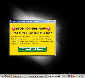
We’re discussing whether our organization will use a popup user survey on our web site . . .

“I propose doing the survey without the popups,” I say. “That’s why browsers have popup blockers, because people don’t like popups. A popup is like a poke in the eye. I don’t like it when things pop up unexpectedly and poke me in the eye. Whenever that happens, I make sure not to go back to that place anymore.”
Unfortunately, no one picks up on the “popped up and poked me in the eye” motif because I was then going to chide them for their junior high school mentality.
“I had a teacher who used to say that,” a young woman says. “‘It’s better than a poke in the eye with a sharp stick.'”
I say, “I used to work with a guy who said, ‘You can’t beat that with a sharp stick.’ Why would the stick have to be sharp if you’re going to beat someone with it? You’re really just looking for something with a little heft to it.”
The same woman says, “I had a boyfriend who used to say, ‘You’re not going to hold that over my shoulder, are you?'”
“You have abysmal taste in men.”
I wasn’t able to persuade the team to abandon the popups. The argument in favor was that a lot of web sites use popup surveys so how bad can they be?
I worked for a dot-com consulting company during the boom and bust of that industry. The whole thing was based on the notion that everyone else is doing it so it must be a good idea.
The subsequent implosion of the entire industry disproved that theory rather dramatically.
Since then, I try to stay open to the possibility that even though a lot of people are doing something, it still may not be a good idea . . .
Thus spoke The Programmer.

what was your alternate solution?
Dynamically include a survey link on the page, maybe with a box around it so it stands out, saying something like
At that point, it makes sense to open the survey in a new window because I specifically asked for the survey to appear.
Most people go to a web site because they are looking for something, often something very specific. This is especially true of the web site to which you’re referring. They scan the page looking for the quickest way to find what they were looking for, and no one comes to that site to browse and read all the information that is presented to them.
To put a survey link on a page, even framing it in a box, will not likely prompt people to click the link because they didn’t come to the site to answer surveys. If something pops up, they have to actively close the window or answer the survey. Either way, an action is required of them. There is no action required if it is just another link on a page that they likely won’t stay on for more time than it takes to find what they need on another page.
The point of the survey is to elicit responses, and the more proactive the user has to be to take the survey, the less likely they are to do so. My opinion is that there will be a better response from a pop up than a link on one or more pages, which is why I would support the pop up in this particular situation.
I do agree that many pop ups are very annoying, but I think surveys pertinent to the site you’re using are not nearly as annoying as advertisements of any kind. Most people want to give their opinion if you ask for it, and a pop up is a more direct way of asking for it than just putting a link on a page, and thus should elicit more responses.
In my mind that’s what is behind the support for the “other sites do this for surveys”, not just the “me too” that you seem to have inferred. I might have said this in the meeting but by the time it was my turn to talk, the discussion had gone down so many different paths, it was nearly irrelevant.
i tried one of those pages. this is what i got on my IE that i never use and have basically default settings on:
“Pop-up blocked. To see this pop-up or additional options click here…”
Yeah, and I’m quickly retracting my support for the pop up as it is now. I still stand by my opinions above in general, but this one really did jump up and slap me in the face, hard, like a British nanny.
It unfortunately is one of those “poke in the eye” kind of pop ups for a couple of reasons. It wasn’t quite as described in the meeting and the immense size of the window wasn’t really discussed at all. It’s quite a bit more intrusive than I had expected. I hope it can be improved to be less of a poke and more of a prod.
And don’t go all juvenile with the humor on me…that description is valid in a completely benign way.