
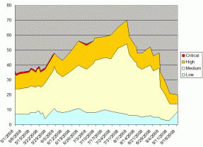
I use charts like this one to track open project tickets, color-coded by priority.
At a meeting last week, I pointed out that the number of open tickets on this particular project had peaked out at 70 and was now dropping faster than the value of my house, at which one of the attendees laughed more enthusiastically than I thought was necessary.
“Why is that funny?” I asked. I mean, it was supposed to be a little funny, but not laugh-out-loud funny.
“I’ve been there,” she said.