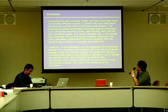
I was watching a webinar this morning and like a lot of presentations, this one had way too many words on the slides.
They weren’t as bad as this but you get the idea.
This approach is lazy, it’s insulting to the audience, and it makes everyone stupider.
For anyone who aspires to do better, the best site I know of on presentations is Presentation Zen.
Here are some sample slides for inspiration.
Bonus link: The Gettysburg PowerPoint Presentation


Sample slides…fantastic. Gettysburg PowerPoint…funny. Presentation Zen site…so busy I couldn’t focus on anything. I could have some form of ADD, if I believed in it, but I found it very funny that a site I expected to be Zen-like in some way as it imparted presentation wisdom to be completely not that way at all.
It totally paralleled the comparison of print media to web media we’ve been talking about all week. The sample slides are great and I believe that guy knows a great deal about using tools well to create memorable live presentations, and almost nothing about how to present those ideas on the web. It’s a shame I can’t focus on the site because I’m sure there is a lot of good information hidden in the too long vertical columns of too many yellow-orange links and too many product suggestions from Amazon.com. I had to scroll 26 pages to get from the top to the bottom…to find a “Next>>”. Unfortunately, I won’t be finding out what is next.
While similar in layout and design to Presentation Zen, your site is infinitely more readable.
Although this site has nothing to do with webinars, it has everything to do with Zen presentation on the web. http://www.dailyzen.com/meditate.asp